In May 2023, a fake photo of smoke rising near the Pentagon spread so fast that the S&P 500 dipped before anyone confirmed the building was untouched. Not one of the accounts pushing it had spent thirty seconds on error level analysis. I run FakeImageDetector, a free scanner built around that exact technique, so I decided to give it a proper stress test. I pulled five of the most viral fake news photos of recent years and scanned the same copies that fooled everyone. Some results confirmed what I expected, and one flat out humbled me.
What Error Level Analysis Actually Sees
Error level analysis re-saves a JPEG at a fixed quality level, then maps how much every region changed in the process. Areas that changed a lot glow bright in the result. Areas that barely moved stay dark. The trick works because each save compresses a JPEG a little differently, so every part of an image carries a memory of its compression history.
In an untouched photo, that history is consistent. Edges glow a little, flat surfaces sit dark, and similar textures behave the same way across the frame. Paste in a face, erase an object, or generate a whole scene from nothing, and the pattern breaks somewhere. ELA turns that break into something your eyes can catch in seconds.
How I Ran the Test
I wanted this to match real life, so I skipped pristine originals and grabbed the widely shared copies, the exact versions that did the damage. Each one went through the free scanner on my site, which layers three checks: an ELA map, a metadata scan that hunts for software fingerprints in the EXIF data, and a lightweight machine-learning model trained on real and manipulated image histograms. The tool hands back a slider comparing the photo against its ELA map, plus a percentage estimate of how likely the image is computer generated or modified.

One honest caveat before the results. Because these were viral copies, every file had already survived several rounds of platform compression before I touched it. That was deliberate. It mirrors exactly what you face when a shocking image lands in your feed.
The Trump Arrest That Never Happened
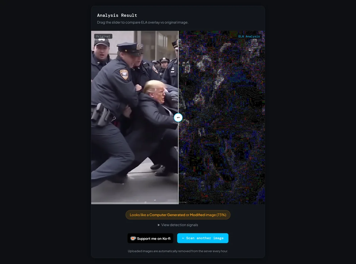
In March 2023, images of Donald Trump being dragged down by New York police officers pulled in millions of views while the world waited on a possible indictment. Eliot Higgins, founder of the investigative group Bellingcat, had generated them with Midjourney and labeled them as AI from the first post. The labels never traveled with the pictures. Midjourney banned him anyway.
My scan came back at 73%. The ELA map sat mostly dark, with ghostly bright halos tracing the officers and their faces, the kind of uneven energy you get when no camera ever captured the scene. Zoom into the source image and the classic tells pile up fast: melted hands, gibberish text on the uniforms, background faces that look half finished.
The Pope in the White Puffer Jacket
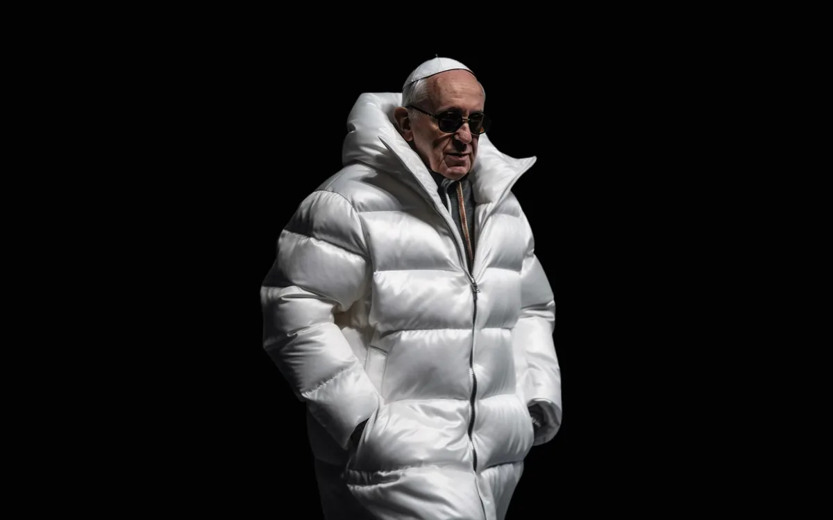
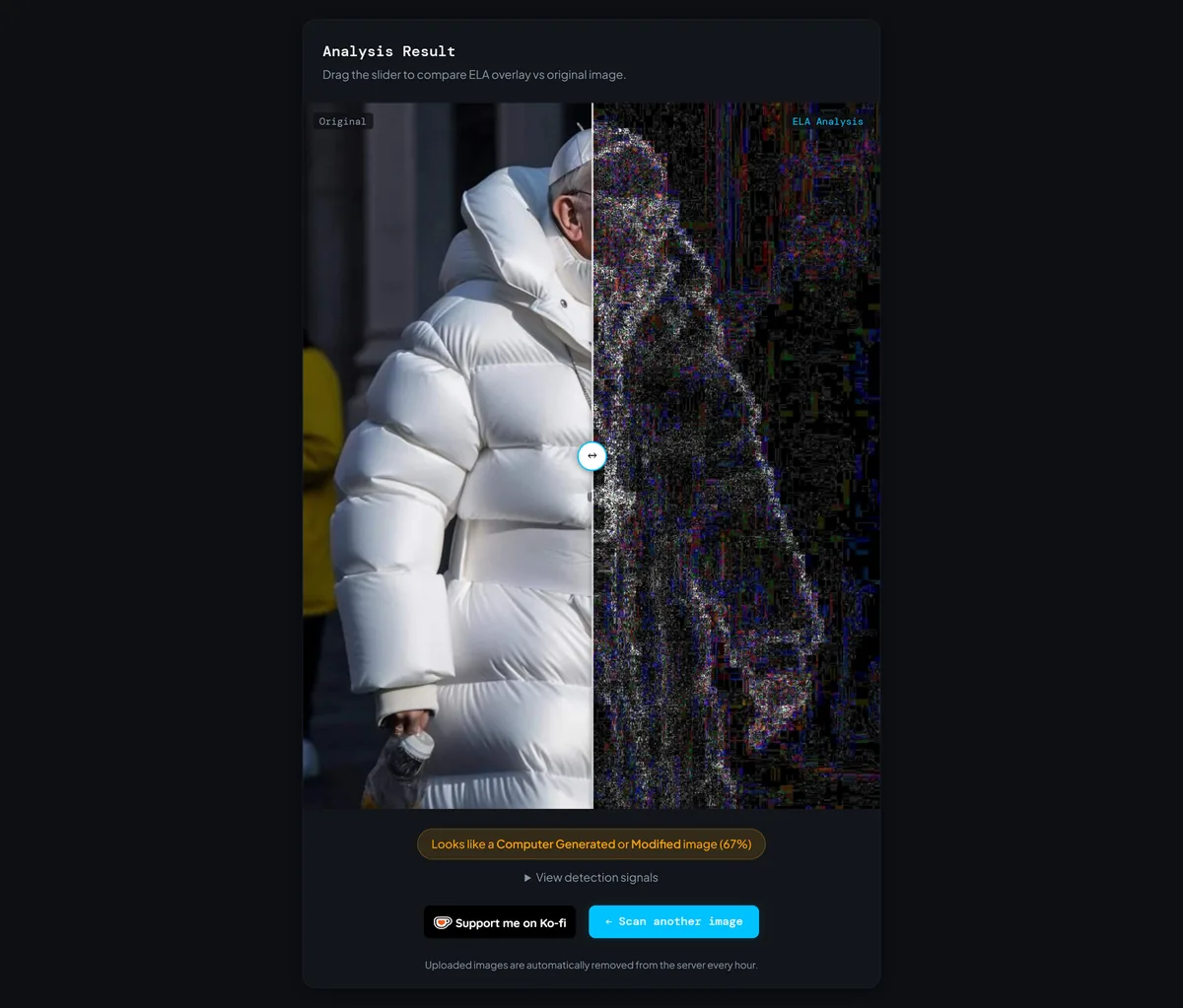
Days later, the internet fell for a much friendlier fake: Pope Francis strolling around in an enormous white puffer coat. A construction worker from the Chicago area made it in Midjourney for fun, and it escaped containment within hours. Even Chrissy Teigen admitted she never thought to question it. Most of us didn't, because a stylish coat demands nothing from your skepticism.
The scanner scored this one 67%. On the ELA map, a bright rim traced the entire silhouette of the jacket while the background stayed quiet, a halo that real fabric in real light almost never produces this cleanly. The human tells are waiting once you slow down, like the crushed grip on the cup and a crucifix chain that connects to nothing.
The most dangerous fakes aren't the shocking ones. They're the ones that ask nothing of your skepticism.
The Pentagon Explosion That Moved Markets
Two months after the Pope, a photo of black smoke boiling up beside an official-looking building spread with claims of an explosion near the Pentagon. Verified accounts amplified it, and the S&P 500 slipped for a few minutes until local officials confirmed nothing had happened. It remains the clearest case of a single AI image brushing up against real money.
My scan returned 73%, and this ELA map was the loudest of the test so far. Instead of one suspicious patch, nearly the whole frame buzzed with multicolor static, plus one blown-out white blob in the sky. That global chaos is a signal in itself. A photo captured once and posted once should not look like every region lived a different compression life.
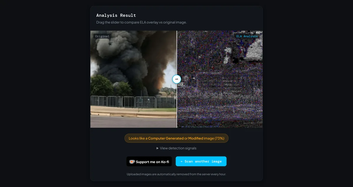
The visual tells close the case. Fence bars melt into one another, the building facade refuses to line up with itself, and the smoke rises from no visible source.
Paris Buried in Garbage
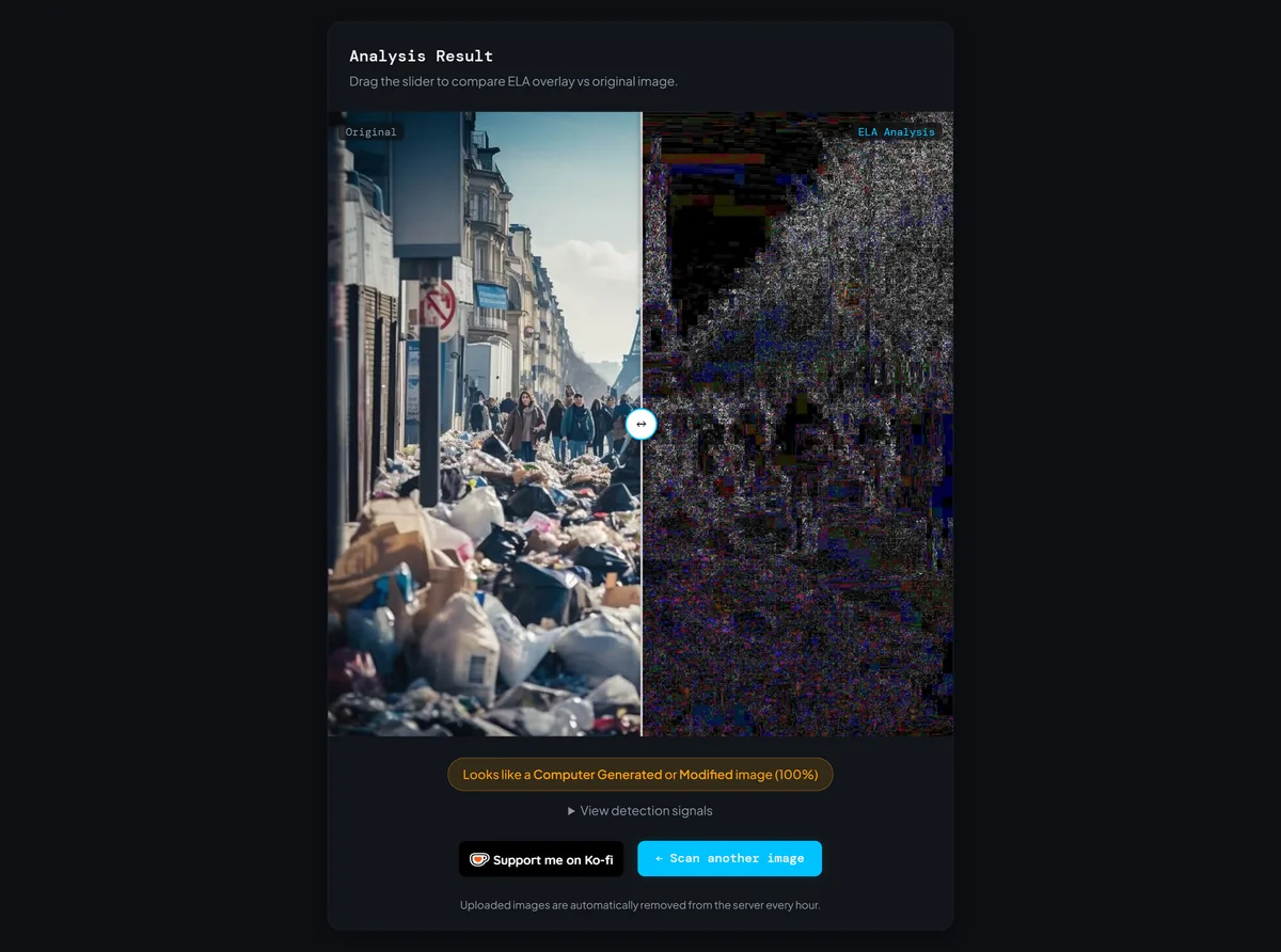
You have probably seen this one: a Paris street drowning in trash bags, with the Eiffel Tower framed neatly in the haze behind pedestrians. Real photos of overflowing bins existed during the 2023 sanitation strikes, which handed the exaggerated AI versions perfect cover. The viral copies showed garbage at a physically impossible scale, often shared to argue that the city had collapsed.
This image maxed out the scanner at 100%, the only one of the five to do it. The ELA map lit up edge to edge with dense rainbow noise, without a single calm region in the frame. When a supposed street photo screams across its entire error map, the verdict nearly writes itself. Want to see the effect for yourself? The scanner on the FakeImageDetector homepage is free, and uploads are wiped from the server within an hour.
Trump Dressed as the Pope
The strangest entry arrived in May 2025, days before the conclave to choose Pope Francis's successor. An AI image of Trump in full papal vestments appeared on his own Truth Social account and was reshared by the official White House account, drawing sharp criticism from Catholic groups still in mourning. Nobody disputed that it was AI generated. This time, the source did the disclosing.
Here's the humbling part: it scored just 50%, the lowest result of my test. My copy had bounced through more re-posts than anything else in this lineup, and each bounce flattens the error levels that ELA reads. A confirmed fake, published from one of the most watched accounts on the planet, and my own scanner could only offer coin-flip confidence.
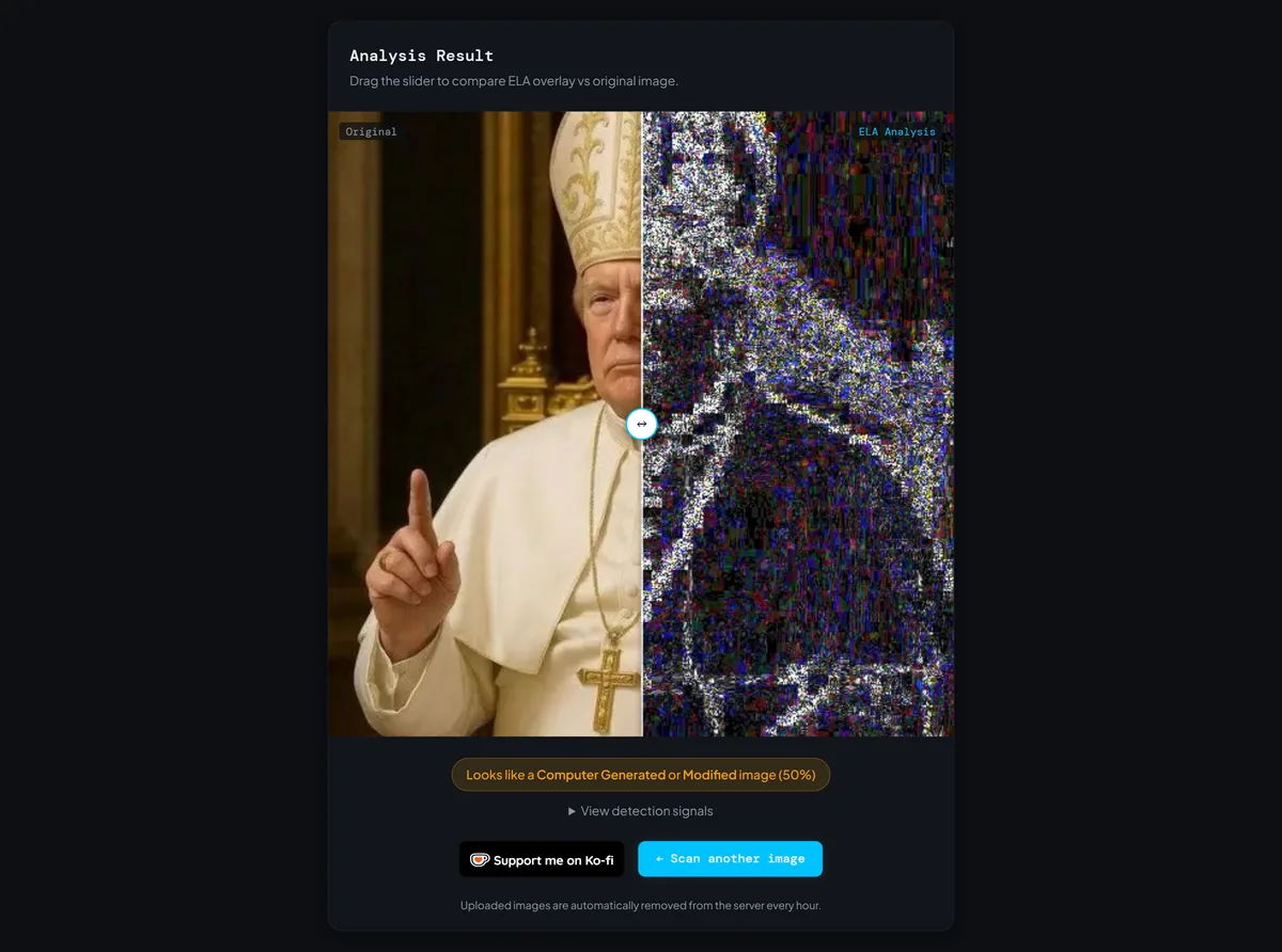
That result is the reason this post exists. A 50% score on a known fake is not a tool failure. It's a lesson in what compression does to evidence, and it's why a score alone should never settle the question for you.
What Five Fakes Taught Me About ELA's Limits
Same technique, same scanner, five images the world knows are fake, and the confidence scores landed everywhere between 50% and 100%. Compression history explains most of that spread. The Paris file I found was relatively fresh and large, so it maxed out. The papal image had been screenshotted and re-posted into mush, so it barely registered.
There's a deeper reason underneath. ELA was designed to catch splicing, where a pasted region carries a different compression past than its surroundings. Pure AI images are born whole, so there is no seam to find. What surfaces instead is stranger: halo edges, uniform static, energy where a camera photo would sit calm. You are not spotting the edit. You are spotting the absence of a camera.
ELA is a flashlight, not a judge. It shows you where to look, and it still needs you to do the looking.
How to Read an ELA Map Without Fooling Yourself
Compare like with like. Edges belong next to other edges, flat surfaces next to flat surfaces, textures next to similar textures. Every ELA map has bright spots, because sharp detail always re-saves differently, so a glowing edge on its own proves nothing. Trouble looks like inconsistency: two similar surfaces behaving differently, or one region carrying a completely different energy than the rest of the frame.
Then weigh the score against the image's journey. A middle score on a tenth-generation screenshot means far less than the same score on a fresh original. In my experience, the most common mistake is reading the percentage as a verdict in either direction. Use it to decide how hard to look, then check hands, text, reflections, and geometry yourself.
Common Questions About ELA and Fake Photos
Can error level analysis detect AI-generated images?
What do the bright areas in an ELA result mean?
Why did five fake photos get five different scores?
Is a 50% score basically a pass?
Scan First, Share Second
Five famous fakes went through the scanner, and every single one left a trace, even when the score stayed cautious. That is the realistic promise of error level analysis. It will not hand you certainty, but it will hand you a reason to pause, and a pause is usually all it takes to stop a fake at your screen instead of passing it along.
Your next step is simple. Pick the most shocking news image you saw this week, hunt down the largest copy of it you can find, and run it through the free scanner on the FakeImageDetector homepage. Drag the slider, ask the three questions from the quick check above, and let the pixels speak before you decide what to believe.